Branding & Web Design Refresh for Fitted Furniture Specialists, Deanes

Deanes is a team of bespoke fitted furniture specialists located just down the road from us in Fareham and has been a long-standing website and marketing client of ours.
Towards the end of last year, they wanted to start exploring a brand and website refresh that would demonstrate the quality of their craftsmanship and drive more leads through a rebuilt user experience flow.
Here’s the approach we took for this project and some comparisons of their website and branding before the project and how it looks today.
UX Research & Discovery
The first step in the project was to audit the existing Deanes website, what areas of the user journey worked well, and any potential roadblocks or issues in the user experience.
We followed this up with a round of competitor research and benchmarking, where we analysed other websites in the bespoke furniture space to see what they do well and how we can create something unique for Deanes.
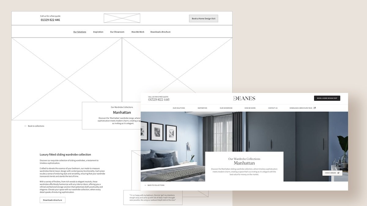
From this research, our UX specialists created new wireframe designs for the website, focusing on making calls-to-action clearer and creating an effortless and continuously flowing user journey.


Refreshing the Deanes Branding
For the branding side of the project, the goal was to help Deanes stand out from their competition by creating a more aesthetic look and feel to their brand identity that reflected the quality and craftsmanship in their work.
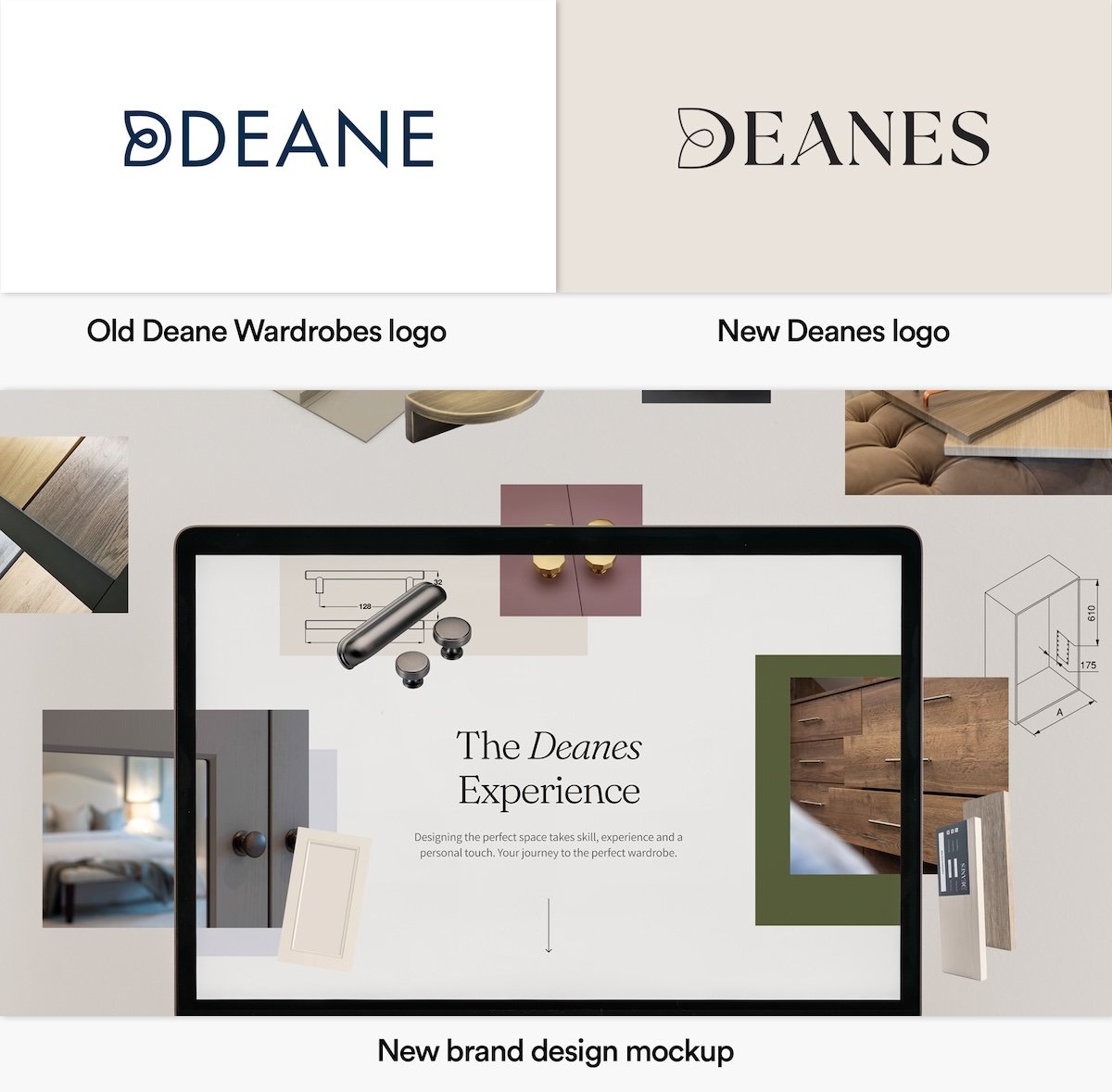
The main focus was to refresh the brand’s logo and colour palette and update their name from ‘Deane’ to ‘Deanes’.
Previously, the Deane logo featured a ‘D’ shape logomark alongside the brand name. Our design team created and updated the logo to include the logo mark in the brand name itself and used a new font to highlight the artistic/design side of their business.
The client wanted to move away from the blue and white tones used previously for the colour palette, so we focused on using soft pastel colours and dark greens and greys to compliment the imagery of Deanes’ interior design work.
Alongside the main brand identity work, we updated the Deanes marketing collateral, including brochures, leaflets, and business cards.
Redesigning the Deanes website
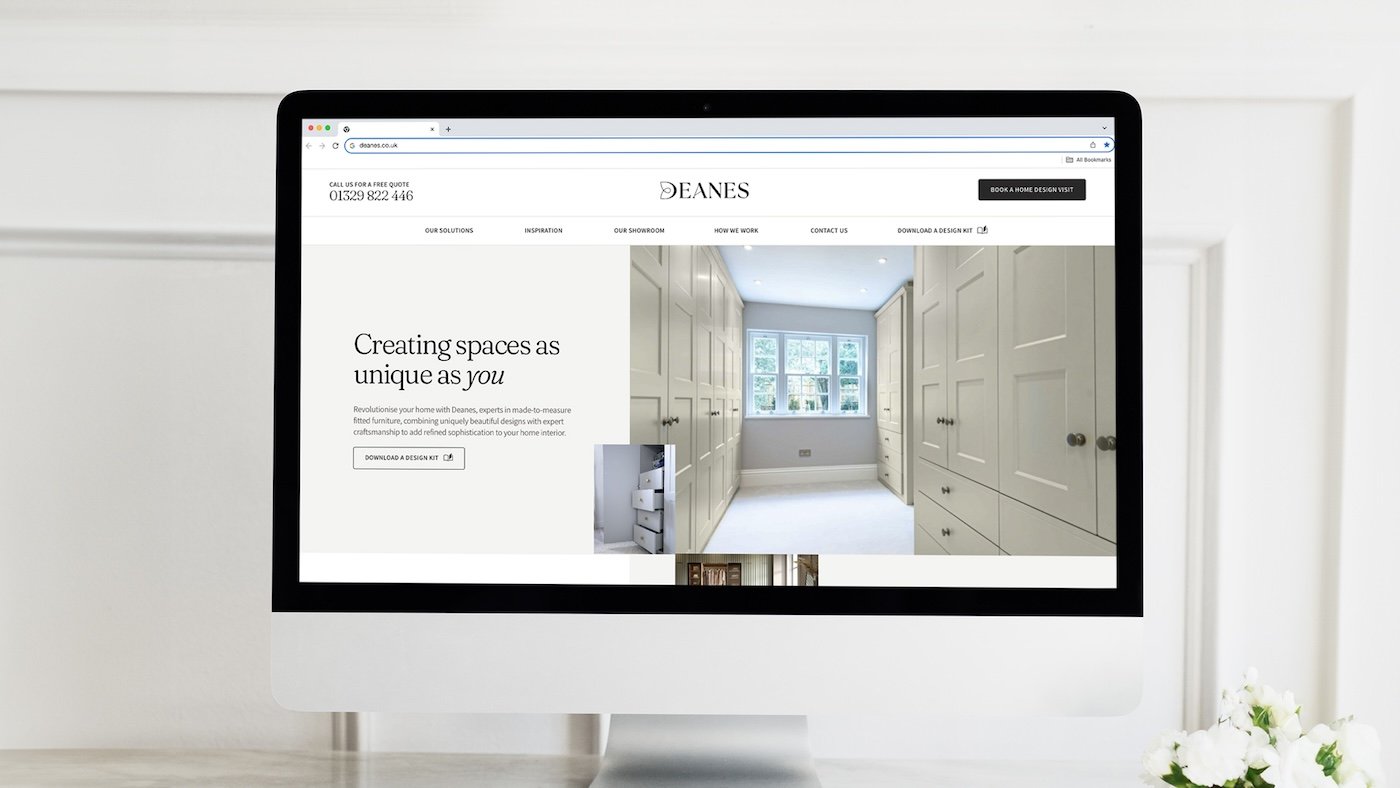
For the website, Deanes wanted a more modern feel and a design that would showcase the quality of the furniture they create.
Using the UX wireframes created at the very start of the project, our web design and development team built a bespoke design and structure for the website.
Their main focus was making the brand stand out from local and national competitors, building the structure and flow with inbound marketing in mind, and creating a best-in-class user experience that performs consistently across all devices.
Learn more about our web design service
The Result.
Since the website launch a couple of months ago, Deanes has been thrilled with the results of the website redesign. They are continuing to work with our marketing teams to send more targeted traffic to the website and generate more qualified leads. Over the last few weeks, they have received some excellent customer feedback about the new website and branding, with many highlighting the ‘premium’ look and feel of the updated designs.
The client is now updating their billboards and other offline marketing materials to be consistent with the changes to the brand.
We’ve used the services of Damteq for around 5 years now and must say it’s one of the best moves we’ve made. Their fluid and strategic approach to our growth plan is both unique and refreshing, and after using most other agencies in the area, we feel we’ve found one that really understands our philosophy and vision, moulding their services to offer the most effective outcome.
