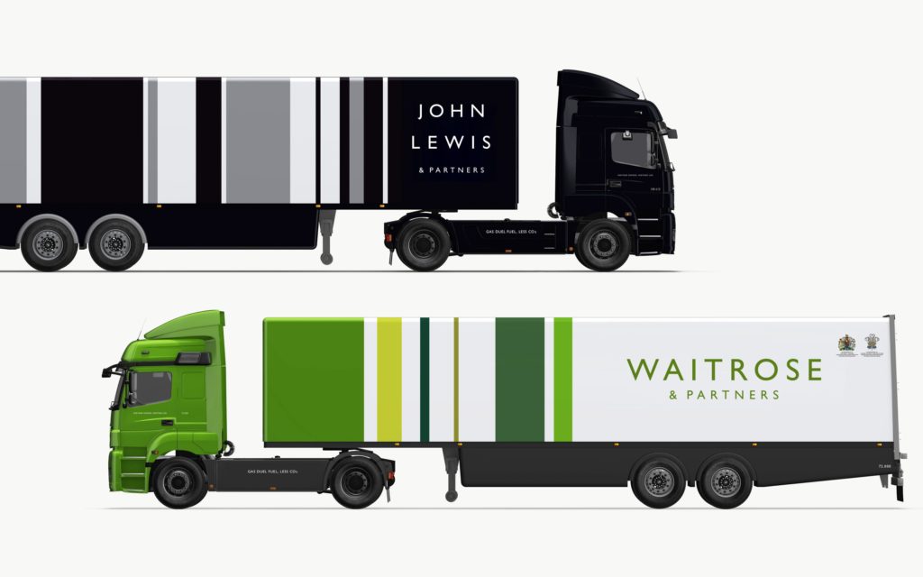
You’re soon going to see a change on the high street and at your local supermarket. Pentagram, the worlds largest independent design consultancy, has designed three new unified brand identities for the John Lewis Partnership and its retail arm of the business John Lewis and Waitrose.
Here are my initial thoughts/opinions on the rebrand:
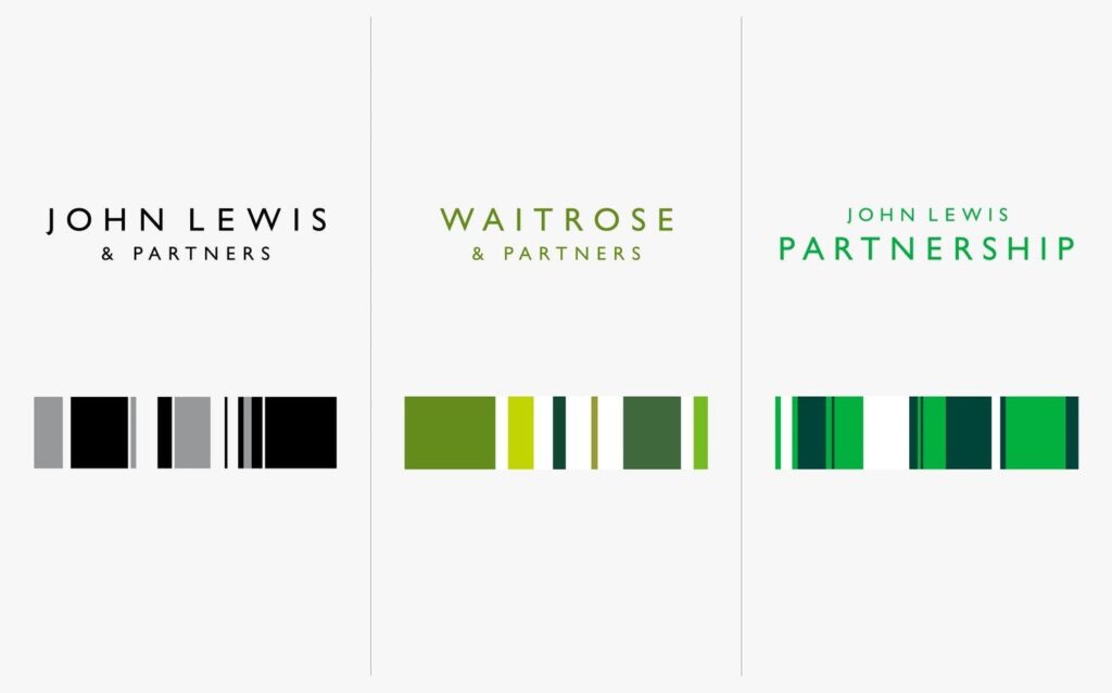
The rebrand encompasses all three areas of the business and enforces the consistent, recognisable and trustworthy aesthetic which the company is renowned for. Its most noticeable feature is the typography, this has been refreshed and handcrafted to create a confident and incredibly contemporary feel. Its simplicity and kerning also highlight the necessity to keep brand identities fresh and show consumers the business is evolving.

John Lewis & Waitrose Branding Before and After
If you think of Waitrose the colour that probably springs to mind is green. Pentagram has ensured that all areas of the business now have a distinctive colour palette and this again solidifies their position within their respective markets.

Supermarket retail has a number of well-established businesses each with distinctive and emphatic identities, Pentagram therefore has ensured that the colour palette for Waitrose is flexible and allows them to assert themselves within this competitive industry.
Crucially, they have ensured that there is more behind the rebrand than what you see on the surface, they have selected a distinct colour, Partner Green, which is a subtle nod towards the companies unique partner programme.

Overall I feel the rebrand presents a unified identity that helps position John Lewis and Waitrose in a competitive market, it displays that the brands have a clear vision for the future and that design will play an important role in it.
I’m keen to hear your thoughts on the rebrand, leave a comment below!
One comment on “Thoughts on The John Lewis/Waitrose Rebrand”
Comments are closed.


Rebranding was NOT even wanted by Partners…Waitrose is a jumped up over priced supermarket with delusions of grandeur