Imagine your favourite brand, whether it offers services, technology, beauty or fashion the font that was selected was done so for a very important reason.
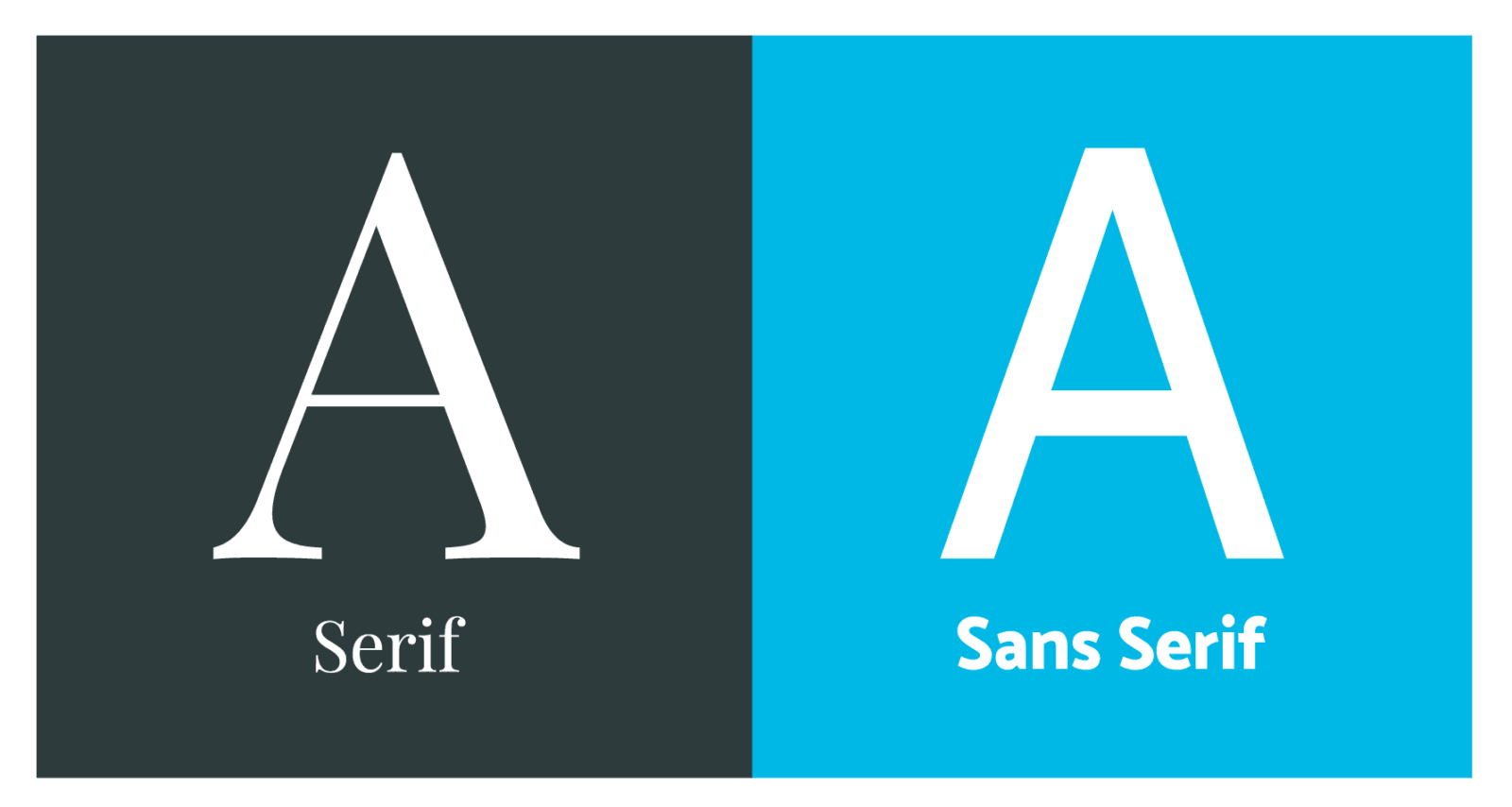
Now imagine the brand with a completely different typeface, for example, if it’s a technology company envision it with a serif font or a font that’s more cursive.

A technology companies logo will want to reflect their ability to stay ahead of market trends meaning it needs to be contemporary and at the forefront of their competitors. The font that goes alongside the logo will also mirror these attributes and reinforce these beliefs.
This also applies to companies at the other end of the spectrum, for example, a traditional company that prides itself on its heritage may not want to use this style font and move more towards one that reflects its values.
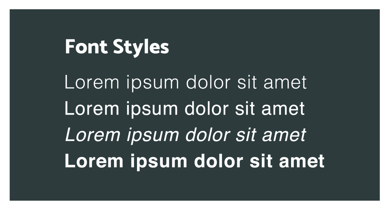
It is imperative that the type is clear and one hundred percent legible, especially if its a new brand as customers won’t be able to create the visual connections that will help make it memorable. It’s therefore wise to find a font family with a broad range of styles, for example, regular, thin, bold and italic. This allows the information that’s presented, whether it’s on a website or something printed, to have a natural hierarchy and ensures the information is coherent.

The idea that a typeface can change the perception of a brand is in fact reality, it is one of the most important parts of the branding and website process and can at times be overlooked by clients. This is when the expertise of a designer comes into its own, a designer will harmonise a logo and font to create a unified and beautiful brand and ensure a clear hierarchy is formed throughout your website.
Our creative team of designers have worked with both large and small businesses to help them create an eye-catching, memorable and lasting brand. To learn more about what our creative team can offer, get in touch by emailing hello@damteq.co.uk or using our contact page here.


